


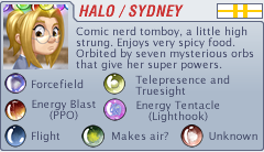
Grrl Power #1400 – So breed me maybe?
The obvious drawback is the constant pregnancy, mood swings, weird food cravings, not being able to drink alcohol or gargle mercury, and oh yeah, the part with a human being ripping its way out of your genitals. Trust me, Maxima immediately brought up all those points, (okay, not the mercury bit) and Sydney immediately derailed her with “What kind of food cravings?” and Max was like, “You know, like pickles and ice cream, or…” and Sydney was all, “Well, that sounds gross, but if I’m craving it… It’d probably be good, right?” And things devolved from there.
The (solid) holograms they were wearing didn’t just magically appear on them. They were (obviously, based on this page) being projected from those spandex-ish zentai suits. Sydney wasn’t wearing one when she was trying out disguises earlier cause she was standing in a projection booth. That’s what those sparkly blue panels were. Also the holoplinth. That mostly just projects the image on the bottom of your feet and undercarriage. And underboob, sometimes, depending on how much vertical occlusion certain body parts might otherwise provide.
This will probably be the only page I’m going to draw them in those outfits, because I spent so much time trying to warp that pattern to their contours. It bugs me when you see a manga and the girls are wearing tartan pleated skirts, and instead of the pattern following the pleats, it’s just a flat texture overlaid over the skirt. You can kind of get away with it on a non-pleated skirt, or a cape or something, as long as it’s hanging limp and not flapping in the wind. But on a shirt? Sleeves never line up with the torso pattern, and if it’s a long-sleeve shirt and the person is bending their elbow, a flat, laid in texture looks terrible. I don’t know how much attention people pay to that. As an artist, I know it bugs me. I will admit that a lot of it depends on the art style. As the realism and detail goes up, the more important it is to contour textures and pay attention to folds and stuff.
So, yeah, this is probably the last time they’ll appear in those.
 Ooh, look! A new vote incentive! And it’s updated with color!
Well, in progress, obviously. I have another one that’s actually a bit further along, but everyone was all, “Sydney Kobold vote incentive!” So I switched to this one. Plus the other one was a multi-character picture so it will actually take me longer to finish. I hope to have an update for this one each week, so stay tuned. There is a slightly higher res version on Patreon.
By the way, this gunmetal blue-ish background and teal pencils are how I draw the comic. I set it up this way so I don’t have to spend all day staring into a bright white blank page.
Double res version will be posted over at Patreon. Feel free to contribute as much as you like.


I mean, I think the scenario requires that Sydney actually be a member of that species. So I’d assume she’d experience whatever pregnancy is like for them, which is probably different than for humans. At the very least, I’d hope the normal pregnancy of an alien species doesn’t involve giving birth to a HUMAN child!
A spacefaring species with access to the kinds of technology seen in the comic so far, who have a vested interest in one specific female making as many children as possible, would probably make extensive use of surrogates rather than wait for a complete gestation.
It would be terribly inefficient to produce one child at a time. On the other hand, mass production would saturate the market and decrease the value of the forehead gem princesses, so they might not be willing to give up their rarity.
You’re assuming the rarer mother with the common father wouldn’t produce a lesser gem as a child. Higher than the father, probably or they wouldn’t be desired, but it wouldn’t necesarily decrease their own rarity. Alien breeding is not necessarily similar to human.
I like that the Mantellans calmed down and realized they got over-excited. It suggests any real star sapphire princesses have a shot at a life that involves more than breeding.
It would’ve been great if at least some of the Mantellans had shown this kind of maturity sooner and tried to stop the oncoming horde, or at least yelled for people to stop being creepers and for Sydney to run faster.
All of the Mantellans that showed maturity sooner simply stayed behind and we didn’t see them chasing Halo.
Downside would be no birth control and endless pregnancies.
I assume Sydney is smart enough to realise that. She and the others are just teasing Maxima.
I think Sydney’s human DNA will not line up properly with the alien DNA, so the zygote would not reproduce and just die as a fertilized egg.
lmao the council has voted
The joke about “Sydney’s people” suddenly made me think of a planet populated by humanoids, the like of which one might expect to meet at various ‘cons.
…
I assume they’d be a very colourful crowd, prone to a great deal of squeeing, arguing, and body modification once they got their hands on the right tech. Mind you, though they’d love space travel and alien contact, I’m not sure how soon they’d achieve it, what with various distractions.
Like regular ‘cons.
Not a boring place for sure.
Instead of pepper spray, civil peacekeepers would carry limited edition keyfigs and similar merch to pacify unruly mobs.
“How Much For Just The Planet”, by John Ford. A Star Trek novel about the Enterprise visiting a planet colonized by SF and fantasy fans.
Please; tell me more.
Is it better or worse than the one with dragons, that got colonized by renfaire enthusiasts?
Don’t think I read THAT one.
It was fairly entertaining light reading. Lots of laughs.
The renfaire planet is mentioned in Star Trek: Lower Decks.
Your undertaking it here. It was a literal FARCE MUSICAL staged by the people of the planet to “get the most” out of their mineral rights negotiations. The author head notes on which tunes the musical numbers were sung to.
SCOTTIE PLAYS GOLF.
MULTIPLE PEOPLE (separately, in sequence) HIDE IN THE SAME CLOSET.
That was the one with the science program featuring dilitium, right?
John Ford wrote the excellent “The Final Reflection”, so probably pretty good.
It wasn’t just mentioned, Lt Commander Billups was from Hysperia, the renfaire planet
Loved “The Final Reflection” – Particularly when the Federation demonstrated transporter technology and said they’d share the tech, and the Klingon representative said something like.
“Thank you. Our technologists will be fascinated to discover why it makes that horrible noise.”
Imagine planet-wide con-funk though.
And constant pandemics of con-flu.
Having seen the ‘pattern on green screen’ effect. I can say it is jarring. It does not move with the character/clothing, often appearing to move on its own.
Now considering their appearance and how they jumped the gun. How do you know those are not ‘Sydney’s people’?
It was established that humans were taken from Earth many times in the past. Also they bred with various aliens to make their own distinct group.
So with Sydney, “Not really hearing a downside, Colonel.”
This. The “pattern on Green Screen” is enough to get me to just shut off and delete a show. *shudders*
That always bugs me when I first notice it, but I’ve learned to force myself to ignore it. As long as I focus on faces and subtitles, the pattern is just a subconscious thing and works just as well as if it’s drawn properly.
It is, however, a ding against the show, so it will contribute to deciding to stop watching it if it’s not otherwise pretty good. Since it almost always happens with school-based shows, and I’m pretty sick of those, it has probably been the deciding factor at last once.
I can see one major downside to being the brood queen of any kind of colony.
Even if the pregnancy is painless and less damaging due to sci fi-tech, even if the lovers are as skillful as they are lovely, and even if the grape feeder only brings you the freshest of dew-kissed produce … you’ll never have a single
soddibloody moment to yourself. You’ll constantly be in the spotlight, getting worshipped instead of treated as a peer and equal.For the rest of your life.
PASS.
For a lot of mammalian species, giving birth is a lot easier than it is for humans. Not sure if it is really easy for some, but humans made it especially painful.
Then there are amphibians or fish or animals like that, that can pop out hundreds to thousands of jelly eggs in one go. That doesn’t sound that bad.
What I want to say is, we do not know how giving birth is for Tzerki.
I accounted for that possibility. But it still involves being watched and potentially crowded for the rest of your days.
It is the large head. Human babies have a disproportionately large head compared to other mammals and that make harder for them to pass by the… well, to pass.
A pelvis for upright walking animals plus a baby with a big skull is a bad combination.
Shouldn’t panel 4 be “TAUT, lean bodies”?
Yep, it should definitely be *taut, lean figures.
It’s one of those words people get wrong far too often. Like when they write “vice” when they mean “vise”.
Thinking of homonyms, there’s the story of the parent who tried to get their toddler to play the role of Julius Caesar. But he was too two to ‘tu.’
He was too two to ‘et tu’?
Nah, he already et.
I once had a guy try to “gotcha” me by “correcting” my use of “fuze” instead of “fuse” because he didn’t realize they were two different words. He thought it was always spelled “fuse” regardless of meaning.
Fuze and fuse aren’t two different words. ‘fuze’ is a variant spelling with some usage difference that depends on whether you are speaking British or American English and separately whether you are in the military or a professional writing in the context of demolitions/munitions.
There is an inverse issue also. Imagine being the male side of the reverse of this situation…trust me. Things can get, sore. Not to mention lowered fecundity due to constant, uh, deployment. Trying to keep it kind and hero safe here. Boss says I got a potty mouth. Now, I’m off to feed the moat critters. Lava moat critters.
Well if there are many males the burden can be shared.
I mean, I’d imagine things could get rather sore for the woman if she’s having sex a large number of times a day as well. Of course, being a broodmare or stud is unlikely to require you to have sex quite that often anyway – I don’t think multiple encounters in a day really increase a woman’s chances of getting pregnant by much (aside from perhaps making it more likely the timing is right, but spacetech should be able to let her know the optimal time for breeding anyway), and unless a man’s harem is absolutely ridiculously large, he can probably handle his breeding duties while only having sex once or twice a day, which a healthy adult male in his prime should be able to manage.
And that’s largely ignoring differences in species as well as the benefits of spacetech and literal magic. Seriously, Sydney regularly consumes a potion that makes her perfectly capable of handling Frix (who is indicated to be sufficiently-well-endowed to cause serious internal damage to Sydney), something that lets a man or woman handle (and satisfy) any number of suitors in a day would hardly be surprising. Might get expensive if you’re basically drinking them like water, but then child-rearing isn’t exactly cheap anyway.
So the Mantellan broodmothers might be the equivalent of preferred customers to the succubus matriarchs?
To me that seems to be the problem with harem novels/comics. That and several mothers-in-law.
“I don’t know how much attention people pay to that. As an artist, I know it bugs me. I will admit that a lot of it depends on the art style. As the realism and detail goes up, the more important it is to contour textures and pay attention to folds and stuff.”
It was very well done, good job!
I always find it funny how those plain like Sydney, are harsh on the the others who are plain.
Pretty sure she isn’t being harsh on the “plain” members of “her people”. Rather the higher-than-average percentage who are morbidly obese and/or don’t follow good hygiene protocols.
“The problem is, too many of ‘my people’ are like that guy you met when you came to the comic shop.”
“Ah.” *(remembers that she needs to get around to changing her ringtone for Sydney)*
Nah, that ain’t being harsh, it’s being honest. Plain people don’t fantasize about other plain people. Ugly people also don’t fantasize about ugly people. I mean, some do, but the vast majority don’t.
Sidney isn’t being mean, she’s being objective. Also keep in mind she’s CONSTANTLY surrounded by the prettiest people on the planet, so she’s even more used to the idea of being SUPER attracted to attractive people than most. Most people never spend any time around a truly beautiful person, because they’re exceptional and rare, but Sidney works with literally dozens of them. Now this isn’t to say us uggos can’t be attracted to less than perfect individuals even under those circumstances, because obviously personality and more take up a huge portion of attraction, but there’s no hiding the fact that appearance plays a large role.
So no, she isn’t being harsh, just realistic about most people’s tendencies and desires with consideration to societal pressures.
If having children sucked that much the human race would have gone extinct millennia ago.
My mom actually enjoyed having children and would have had more than 4 if dad hadn’t said no.
(Understand my mom was a fashion model before marrying my father and four kids barely left a mark on her).
Err hate to be that guy but “Taut”!
I love to be the guy who points it out. Admit it, so are you.
So panel 4, typo alert, last words should be: “taut and lean bodies”.
“Oh, well, we can turn this ship around and turn you over…”
“Just kidding!!!”
Sydney is on the cusp of realazing the untapped market for Mantellan beefcake/xheesecake pinup calendars
Truth be told, yes, it IS disconcerting for a pattern to continue unbroken on clothes even if it logically would. The ‘worst’ example I can think of is Stan the salesman from the Monkey Island series, whose coat was just that, a pattern fill of where his arms would go (and boy did they go). It does explain why intricate patterns are rare in comics though.
I really appreciate the detail you put into mapping the hologram projector pattern onto their bodies. Although I definately appreciate that it’s way too much effort to do regularly.
I do notice pattern overlays on clothes being wrong, but…I like it. I think it’s a pretty and enjoyable artistic shortcut.
The pattern overly always reminds me of the 1940/50’s era cartoons. The smarmy salesman/television host in some of the Bugs Bunny and Daffy Duck cartoons comes to mind.
Sydney does have to understand, sooner or later her “human-ness” would be discovered, never mind the fact that her first birth, even if possible, would be a dead give-away. As far as comic-con types aren’t all bubble-bellies, granted most of them lol, but like myself, I was into body-building as a teen and martial arts later on. Both of which would increase testosterone and libido levels… My wife would complain some days ;) but these days, my age and poor health, she’s off the hook lol. Besides, Sydney was quoted as being one of the most “desirable bachelorettes” because of who she is and a member of, so I doubt she’d have much trouble if it’s what she really wants. It’s all just to tweak Max’s femdom-ness.
I am pretty much certain that Sydney understood the downside of joining a Mantellan den before Maxima did.
That whole Benny Hill chase scene started with her saying (paraphrased) “Funny that. Basically … run” (to mix Brittish metaphors)
This discussion is indeed just the crew teasing Maxima.
(It’s the adrenaline, you see … ? Cats whack mice around to get ease down from the rush. Arc swat, not always being the most law abiding and mature individuals, bear bait Maxima)
So how do you pee in one of those suits? I’m not seeing any seams and it looks like Digit is exiting hers via the neck. Unless it has some amazing stilsuit technology going to the restroom is going to be a chore.
I choose to believe that species has disproportionately large penises that are heavily barbed.
Given Sydney’s proclivities so far with space boyfriends…
She may have chosen her disguise for a reason.
The only place I will give a pass to lazy patterning is on Stan S. Stanman from the Monkey Island series, because it’s become a running gag.
Looking at history, a female used as a broodmare has MANY downsides.
They won’t be “serviced” in the “wait on me hand and foot” variety, but in the “you’re tied down to the bed, and maybe, if we feel like it, you’re going to be fed and cleaned up enough that you won’t die.”
Then either one guy having his way with you, consent a pipe-dream, or a long line of guys having their way with you.
And they’re not going to be nice…
I am vaguely disappointed in Max for assuming that a forehead gem, even if hereditary, would lead to being a “brood mare.” Among humans having someone distinguished for a thing that’s definitely genetic, from beauty to sports prowess, on “your” team is a matter of national pride, but our beauty contest winners and gold medal winners don’t get locked into a maternity ward.* We just like to pretend that they are “typical” of us, which gives us status.
Warping the pattern on the outfits makes them look much better. I noticed. It was worth the effort in my opinion.
My favorite part of this page is Max’ reaction to everyone else. “Who would want to be a broodmare for an endless succession of attractive and virile males, who won’t even let you have a career outside the bedroom!?”
“Me!” “Me!” “Me!” “Me!” “Me!” “Me!”
“…”
as a non-artist… it does bug me too!
HERE is my quote. Sloppy patterning bugs me a LOT. I noticed you got it right, and I appreciated it even before reading the note.
Is it just me or does Daphne’s hips look thicker than usual in the last panel? A bit Pixar mom-like but in a good way.
Maybe we’ll get the answer to the question if one gains weight, do the others?
[sigh] bodysuits…
It is not quite Starfleet Black, but still a infiltration bodysuit.
Maybe I’m being overly positive, but I’d see sapphire princesses as more like Keldas from the Discworld series.
From Wikipedia:
“Nac Mac Feegles possess a eusocial culture similar to bees, termites and other social insects. The clan is made up of hundreds of brothers, and one mother, called a kelda. When a Clan’s kelda dies, another is imported from a different clan. The new kelda chooses her husband, known as the Big Man, from among her adopted Clan when she arrives, and soon begins the lifelong task of begetting the next generation, often up to one hundred tiny baby Feegles at a time.
Depending on how long the kelda has been kelda, the majority of the tribe will either be her brothers-in-law (i.e., the sons of the previous kelda) or her sons. Daughters are very rare and, on coming of age, leave to become kelda of another tribe, taking some brothers, probably including a gonnagle (see below) with her. Young keldas are slim, but older keldas are virtually spherical. They also enjoy the odd nip of Special Sheep Liniment (which on no account should ever be given to sheep).”
Speaking as someone who deals with *actual* Broodmares (*Horses*, you bunch of sickos; and we *rehab* them); Nobody is getting that right… it’s a terrible, miserable life; with your vitality gone in half (or less) of your allotted time on this (or any other) world.