


Grrl Power #986 – Smoosh is in the air
Just to make sure all the text on this page is fully legible, I’m going to post this page over at Patreon so everyone can see the double size version.
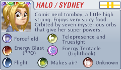
For some reason, I decided to include two different pages on this page. I don’t usually do color coded word bubbles, so hopefully this all makes sense and you guys can follow along. I had actually considered doing character specific word bubbles when I started the comic, but I’m really glad I decided against it for a few reasons. For one, back before I started, I read a lot of webcomics – some were good, most were people who had some funny ideas or had some interesting stories to tell, but weren’t the best artists. Not that a comic has to have impeccable art necessarily, but there is a threshold of acceptability I think, and that includes not just the art, but also stuff like coherent sequential storytelling skills, layouts and design. There were definitely a few webcomics I gave up on because the artist decided to put black “monster text” over bright red word bubbles (note that I use a fairly legible bold font for Tom and put it over more of a creamy red/red/orange instead of a blinding rose red) or they would use some fancy script font in all caps. If I’d started the comic with character specific word bubbles, I would have felt obligated to use unique combinations of fonts and colors for every single person. There’s only so many properly legible combinations, and somewhere around page 300 I’d be putting teal lettering over bright orange bubbles using a sound effects font for “Barista #3” and honestly it would become an absolute eyesore and really, there’s only a few cases where it would even be helpful. It’d be a TON of extra work to keep track of and not that many readers would even pay attention to it, (Not everyone even realizes Sydney’s orbs slowly orbit her from panel to panel) and if I tried to do something clever like having a shapeshifter using the wrong text/color combination, I’m guessing like 5% of people would get it, 15% would think I messed up, and no one else would notice.
So that’s why I don’t do it. Usually.
And yes, the final panel is supposed to say “Marital Arts,” not “Martial Arts.”
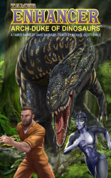
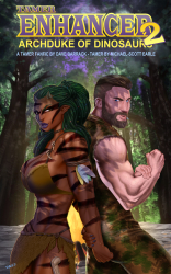
Tamer: Enhancer 2 – Progress Update:
Nothing to report unfortunately. Was working on the vote incentive thing.
 October’s vote incentive is up! This is a redraw of a comic I did in 2011 I think, but never published. I had originally pictured the comic going through an establishment phase, and then taking occasional breaks from the storylines for little one-off moments like these. Which I guess I could still do. I just got wrapped up in the story telling and forgot.
So Dabbler and Sydney are up late one evening on night watch but Dabbler has just discovered Cinemax…
Nude version is up at Patreon, as is the original version of this page.
Double res version will be posted over at Patreon. Feel free to contribute as much as you like.


So, they’re guarding Kevin? I’m curious how that works, since powered down he can probably wipe the floor with them. They’re more of an alarm system to alert the heavy hitters?
I expect he got away while these hijinks were going on…
Took me three reads to figure out the color difference between Max and Sydney’s balloons here.
Was the “marital arts” – as opposed to “martial arts” – deliberate? I mean, I’m going to assume it’s deliberate, given your track record so far, but it’s worth asking.
He already answered that question. Anticipated it, even. Read the author notes below the page.
Whoops. That’s what I get for skimming, I guess.